Draggable Grid
Pannable grid with smooth drag and momentum


Customize
Layout
Animation
Interaction
Props
| Name | Type | Default | Description |
|---|---|---|---|
items | GridItem[] | [] | Array of items to display in the grid. Each item has id, image, dataId, and alt. |
columns | number | 10 | Number of columns in the grid layout. |
enableDrag | boolean | true | Enable drag functionality to move the grid around. |
enableWheel | boolean | true | Enable mouse wheel scrolling to navigate the grid. |
edgeResistance | number | 0.9 | Edge resistance when dragging (0-1). Higher values provide more resistance. |
introDuration | number | 1.2 | Duration of the intro animation in seconds. |
onItemClick | (item: GridItem, index: number) => void | undefined | Callback function when an item is clicked. |
className | string | "" | Additional CSS classes for the main container. |
gridClassName | string | "" | Additional CSS classes for the grid container. |
itemClassName | string | "" | Additional CSS classes for individual grid items. |
boundsPadding | { x: number; y: number } | { x: 200, y: 100 } | Padding in pixels for drag bounds. |
containerMode | "fixed" | "absolute" | "absolute" | Container positioning mode. 'fixed' for full viewport overlay, 'absolute' for contained layout. |
scale | number | 1 | Scale factor for the entire grid. 0.5 = half size, 2 = double size. |
gap | number | 5 | Gap between items in viewport width units (vw). |
wheelSmoothing | number | 0.3 | Wheel scroll smoothing duration in seconds (0.1-1.0). Higher values create smoother, slower scrolling. |
itemsGridItem[]Array of items to display in the grid. Each item has id, image, dataId, and alt.
[]columnsnumberNumber of columns in the grid layout.
10enableDragbooleanEnable drag functionality to move the grid around.
trueenableWheelbooleanEnable mouse wheel scrolling to navigate the grid.
trueedgeResistancenumberEdge resistance when dragging (0-1). Higher values provide more resistance.
0.9introDurationnumberDuration of the intro animation in seconds.
1.2onItemClick(item: GridItem, index: number) => voidCallback function when an item is clicked.
undefinedclassNamestringAdditional CSS classes for the main container.
""gridClassNamestringAdditional CSS classes for the grid container.
""itemClassNamestringAdditional CSS classes for individual grid items.
""boundsPadding{ x: number; y: number }Padding in pixels for drag bounds.
{ x: 200, y: 100 }containerMode"fixed" | "absolute"Container positioning mode. 'fixed' for full viewport overlay, 'absolute' for contained layout.
"absolute"scalenumberScale factor for the entire grid. 0.5 = half size, 2 = double size.
1gapnumberGap between items in viewport width units (vw).
5wheelSmoothingnumberWheel scroll smoothing duration in seconds (0.1-1.0). Higher values create smoother, slower scrolling.
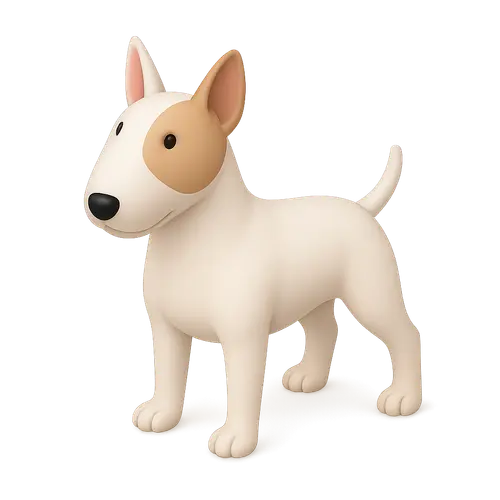
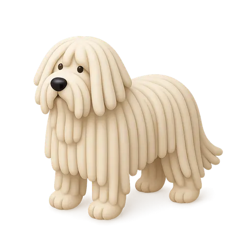
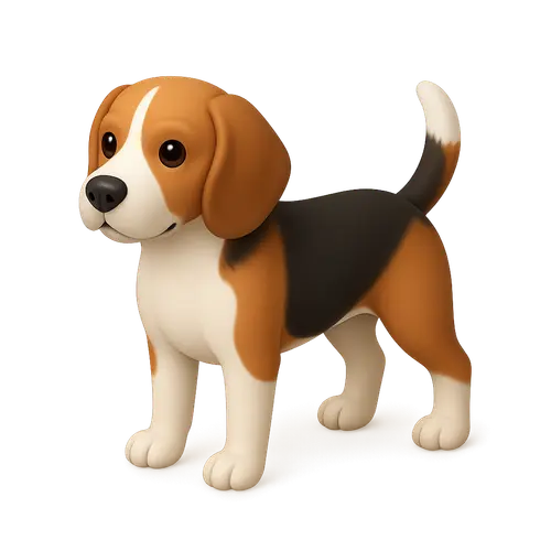
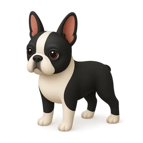
0.3Demo images from thiings.co, not part of the React Bits Pro offer.