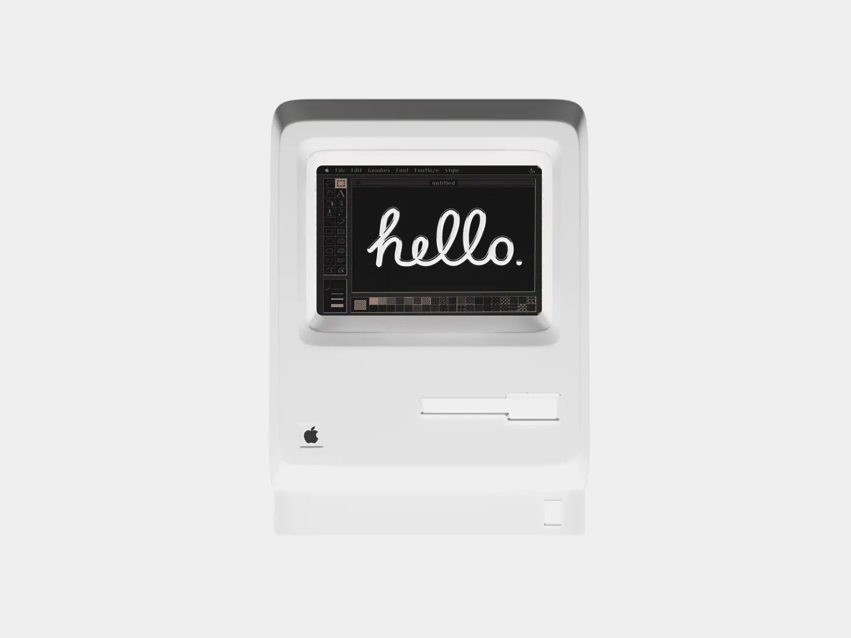
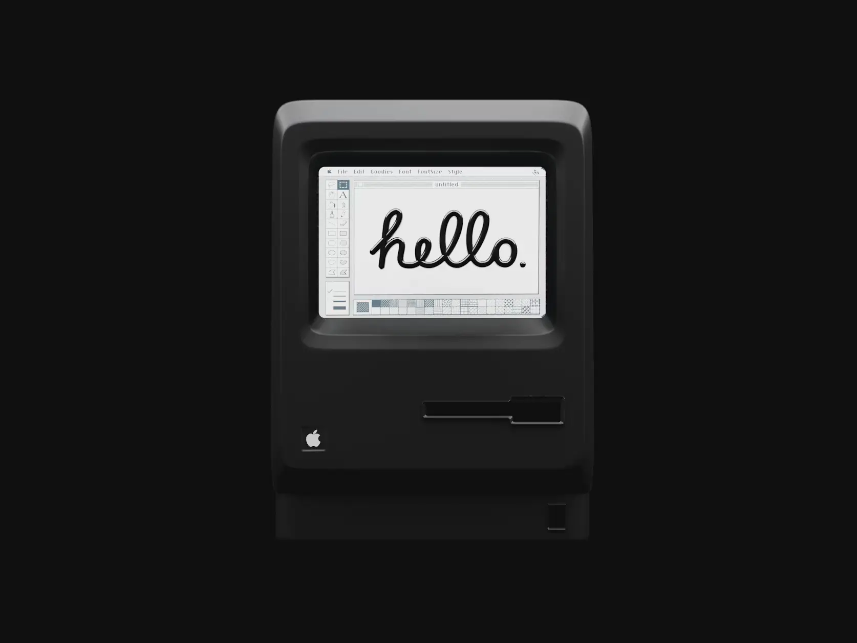
Comparison Slider
Before/after image comparison with draggable or hover controls
Customize
Layout & Slider
Divider & Handle
#ffffff#ffffffLabels & Percentage
Props
| Name | Type | Default | Description |
|---|---|---|---|
beforeImage | string | "" | URL for the before image (left/top layer) |
afterImage | string | "" | URL for the after image (right/bottom layer) |
beforeAlt | string | "Before" | Alt text for the before image |
afterAlt | string | "After" | Alt text for the after image |
initialPosition | number | 50 | Initial position of the slider (0-100) |
orientation | "horizontal" | "vertical" | "horizontal" | Orientation of the slider |
enableInertia | boolean | true | Enable inertia/momentum on drag release |
dragOnHover | boolean | false | Enable drag on hover without clicking |
autoAnimate | boolean | false | Auto-animate slider with smooth random movement |
dividerWidth | number | 3 | Width of the divider line in pixels |
showHandle | boolean | true | Show the draggable handle with icon |
handleSize | number | 48 | Size of the handle in pixels |
handleIcon | React.ReactNode | undefined | Custom icon component for the handle |
dividerColor | string | "white" | Color of the divider line |
handleColor | string | "white" | Color of the handle background |
onPositionChange | (position: number) => void | undefined | Callback when slider position changes |
className | string | "" | Additional CSS classes for the container |
imageClassName | string | "" | Additional CSS classes for both images |
showLabels | boolean | false | Show before/after labels on images |
labelText | { before: string; after: string } | { before: "Before", after: "After" } | Custom text for labels |
labelPosition | "top-left" | "top-right" | "bottom-left" | "bottom-right" | "top-left" | Position of the labels |
labelClassName | string | "" | Additional CSS classes for both labels |
beforeLabelClassName | string | "" | Additional CSS classes for before label |
afterLabelClassName | string | "" | Additional CSS classes for after label |
showPercentage | boolean | false | Show percentage indicator |
percentagePosition | "top" | "bottom" | "top" | Position of percentage indicator |
onDragStart | () => void | undefined | Callback when drag starts |
onDragEnd | () => void | undefined | Callback when drag ends |
ariaLabel | string | "Image comparison slider" | Custom ARIA label for accessibility |
reducedMotion | boolean | false | Respect prefers-reduced-motion setting |
beforeImagestringURL for the before image (left/top layer)
""afterImagestringURL for the after image (right/bottom layer)
""beforeAltstringAlt text for the before image
"Before"afterAltstringAlt text for the after image
"After"initialPositionnumberInitial position of the slider (0-100)
50orientation"horizontal" | "vertical"Orientation of the slider
"horizontal"enableInertiabooleanEnable inertia/momentum on drag release
truedragOnHoverbooleanEnable drag on hover without clicking
falseautoAnimatebooleanAuto-animate slider with smooth random movement
falsedividerWidthnumberWidth of the divider line in pixels
3showHandlebooleanShow the draggable handle with icon
truehandleSizenumberSize of the handle in pixels
48handleIconReact.ReactNodeCustom icon component for the handle
undefineddividerColorstringColor of the divider line
"white"handleColorstringColor of the handle background
"white"onPositionChange(position: number) => voidCallback when slider position changes
undefinedclassNamestringAdditional CSS classes for the container
""imageClassNamestringAdditional CSS classes for both images
""showLabelsbooleanShow before/after labels on images
falselabelText{ before: string; after: string }Custom text for labels
{ before: "Before", after: "After" }labelPosition"top-left" | "top-right" | "bottom-left" | "bottom-right"Position of the labels
"top-left"labelClassNamestringAdditional CSS classes for both labels
""beforeLabelClassNamestringAdditional CSS classes for before label
""afterLabelClassNamestringAdditional CSS classes for after label
""showPercentagebooleanShow percentage indicator
falsepercentagePosition"top" | "bottom"Position of percentage indicator
"top"onDragStart() => voidCallback when drag starts
undefinedonDragEnd() => voidCallback when drag ends
undefinedariaLabelstringCustom ARIA label for accessibility
"Image comparison slider"reducedMotionbooleanRespect prefers-reduced-motion setting
falseDemo images by Alexander Shatov @ unsplash.com, not part of the React Bits Pro offer.